

Sinking cities
Why your town could have double the global rate of sea level rise

Much of the
Bay of Plenty
will have more
time to prepare
Sea level rise happens
Slower
Faster
-0.5
0
0.5
m
than average by 2100 under
high emissions (SSP3-7.0)
Parts of Christchurch
are sinking while
others are rising,
but the city is overall
more vulnerable to
sea level rise

Stable or rising land will buy much of the Bay of Plenty more time to prepare for higher sea levels
Many parts of Auckland's coast are sinking surprisingly rapidly
Sea level rise happens
Slower
Faster
-0.5
0
0.5m
The Wairarapa coast is sinking rapidly, doubling the effects of sea level rise
than average by 2100 under
high emissions (SSP3-7.0)
Parts of Christchurch are sinking while others are rising. Some popular beaches are slightly more vulnerable to sea level rise because of subsidence

Stable or rising land will buy much of the Bay of Plenty more time to prepare for higher sea levels
Many parts of Auckland's coast are sinking surprisingly rapidly
Sea level rise happens
Faster
Slower
-0.5
0
0.5m
than average by 2100 under
high emissions (SSP3-7.0)
The Wairarapa coast is sinking rapidly, doubling the effects of sea level rise
Parts of Christchurch are sinking while others are rising. Some popular beaches are slightly more vulnerable to sea level rise because of subsidence
🤔 What am I looking at? The unlucky places are in bright pink. You might think the ocean would rise evenly around our coastline. This map shows how far from the truth that is - and how widely different the experience of sea level rise will be for different parts of the coastline. Unlucky places in bright pink could see an extra half a metre by the end of the century. Fortunate spots in shades of gold will experience less sea level rise than the rest of us, thanks to quirks of their geology.
Note: this map is based on high (but plausible) greenhouse gas emissions, well above what countries are aiming for under the Paris Agreement. However, the same geographic pattern applies at lower global heating levels, even though the amounts of sea level rise are smaller.


A huge new public data set shows many communities are sinking, speeding up the effects of sea level rise. A lucky few are rising, making for wildly varying situations around the coast.

ELOISE GIBSON
Climate Editor

FELIPPE RODRIGUES
Data Reporter
You might not notice if you’re strolling along the harbour, but much of Auckland is sinking.
So is much of Wellington, bits of Christchurch, most of the Wairarapa coast and land around Napier airport.
In contrast, much of Tauranga is standing still or even rising gradually out of the ocean.
The tiny settlement of Pīkowai (between Te Puke and Matatā in the Bay of Plenty) is rising fast, in geological terms, while Thames is on a veritable roller-coaster ride. In the space of just 2km of shoreline, Thames goes from rising, to sinking, to rising again.
None of these movements is big enough to bother the average resident as they go about their daily lives - they amount to just 0-4mm of movement a year.
However, new measurements of these movements - released publicly today, for every 2km of New Zealand’s coastline - drastically change how long many communities have to prepare for coastal floods.
Take Lowry Bay, a narrow, rocky swimming beach in Wellington’s Lower Hutt, around the coast from Petone.
This gravelly piece of seaside is sinking up to 3.8mm a year, coincidentally about the same amount (3.5mm) that the sea around New Zealand is rising. Add the two together and you get double the global average rate of sea level rise.
Search your region:
Sea level rise (m) projections under high emissions scenario
Double tap to zoom and pan
Surprisingly, small amounts of sea level rise can have devastating impacts: research for former Parliamentary Commissioner for the Environment Jan Wright found just 30 centimetres higher seas would turn a one-in-100 year flood event in Wellington into an annual event for the capital.
That’s the kind of extreme flooding that, today, is considered rare - and it’s big enough to gouge the city’s seawalls.
You might expect the oceans around Aotearoa would rise evenly, like a filling bath - and indeed, that’s what most of our coastal planning assumes will happen. National guidance published by the Ministry for the Environment projected 0.46–1.05m of sea-level rise by 2100, depending on how quickly people and governments cut carbon emissions. Like most countries, New Zealand has based its planning mainly on global average projections from the Intergovernmental Panel on Climate Change (IPCC).
But as glaciers and polar ice sheets melt and sea water expands with heating, it won’t affect every bit of coast evenly.
Not only do gravity and local factors, such as the slope and shape of harbours, affect how far the flooding goes - it turns out Aotearoa’s coast is itself sinking and rising, by wildly varying amounts.


Flooding on Tāmaki Drive in 2015. Photo: Bevan Read/Stuff
Flooding on Tāmaki Drive in 2015. Photo: Bevan Read/Stuff
The new dataset from the NZ Searise project (which includes scientists from GNS Science, Niwa and Victoria University) shows how these movements affect the entire coastline. The project uses Synthetic Aperture Radar Interferometry (InSAR) data; researchers gather and compare radar “pings” received back from satellites bouncing off Earth. By comparing radar images of the same location, they measured movement of the ground surface toward or away from the satellite. They then checked the accuracy of their findings by comparing them with nearby GPS readings.
It’s not perfect. The measurements are spaced 2km apart (meaning they miss some local changes) and some places have more accurate estimates than others. The results are median numbers drawn from a comparatively short time record (2003-2011), and they assume future land movements will be similar.
But it’s the first time New Zealand’s whole, wobbly, shifting coast has been tracked with this kind of coverage and accuracy.
And it shows how out-of-sync with reality our one-size-fits-all approach has been.

Where the NZ coast
is sinking or rising
How to read this:
North island
Sinking
Rising
NLD
AKL
east
AKL
west
WKT
west
WKT
east
TAR
BoP
WLG
GIS
HWB
MAR
NEL
South island
TAS
CAN
WC
OTA
SOU

Where the NZ coast is
sinking or rising
How to read this:
North island
South island
Rising
Sinking
MAR
NEL
TAS
NLD
AKL
east
CAN
AKL
west
WC
WKT
west
WKT
east
OTA
TAR
BoP
WLG
SOU
GIS
HWB

Where Aotearoa’s coast is sinking or rising
How to read this:
Rising
Sinking
North island
South island
MAR
NEL
TAS
NLD
CAN
AKL
east
WC
AKL
west
WKT
west
WKT
east
OTA
TAR
BoP
WLG
SOU
GIS
HWB

Where Aotearoa’s coast is sinking or rising
How to read this:
Rising
Sinking
South island
North island
MAR
NEL
TAS
NLD
CAN
AKL
east
WC
AKL
west
WKT
west
WKT
east
OTA
TAR
BoP
WLG
SOU
GIS
HWB
🤔 What am I looking at? At first glance, these two ring-shaped graphics might not put you in mind of the North and South Islands. Look closer, however, and they reveal how much the land is rising and subsiding in your region - and the huge variation around our coasts. To find your region, look at the ring representing your island (left is North, right is South). Follow the ring down to move south down and around your island. The west coast is on the left, the east coast on the right, just as they would be on a map. Some regions (such as Auckland and Waikato) straddle both coasts, so you’ll see their west coasts on one side and east coasts on the other. If the jutting lines are shaded pink and pointing towards the middle of the ring, your region is sinking. You’ll see that that’s the case for most of the North Island, aside from a few lucky points where the lines jut outwards into the grey-shaded area, indicating rising land. Each jutting line represents a point on the coast 2km from the last one, which is why Northland and Southland, with their long coastlines, seem to occupy so much of their circles. The length of each line represents how much the land at that point is sinking or rising each year. You can see that one region has the most dramatic movements (clue: it’s also where the politicians live).
“Based on current international emissions reduction policies, global sea levels are expected to rise about 0.6m by 2100,” says Tim Naish, who co-leads the programme. “However for large parts of Aotearoa this will double to about 1.2m due to ongoing land subsidence,” he says. “We have less time to act than we thought.”
Back to Lowry Bay, which neatly demonstrates the problem. The sinking of the land there means that instead of 15cm sea level rise over the next 30 years, the area is in line to get 30 cm, says Richard Levy, the Searise project’s other co-leader. (All projections in the Searise project are against 2005 levels).
“If you're planning for that 30cm threshold that turns a 100-year [flood] event into an annual event, you might think you'd have until 2070 until that threshold was breached, if we managed to track along on the Paris [Agreement] and get our emissions under control,” says Levy.
“But with vertical land movement, you bring it forward to 2040. So you lose 30 years’ of time,” he says.


Waves smashing over the road at Lowry Bay. Photo: Robert Kitchin/Stuff
Waves smashing over the road at Lowry Bay. Photo: Robert Kitchin/Stuff
Residents plan their lives around these kinds of projections. Whether they’re investing in coastal buildings or renovations, looking to buy seaside property, or wondering whether their new abode will qualify for flood insurance, they could be looking at flooding risk maps made by councils, using average sea level rise. Councils rely on projections too, for planning and maintaining town centres, roads, airports and water pipes and writing development rules.
Even small differences matter: An assessment in 2019 found that for every 10 centimetres of sea level rise, thousands of people and billions of dollars worth of houses - plus more roads, pipes and infrastructure - become exposed to potential flooding during extreme events.
Going up, going down
Land sinks and rises for all kinds of reasons.
There might be an old landfill whose compacted rubble is slowly subsiding beneath the surface (as there is in part of Thames). A town might be built on the slowly-compacting sediment of an old river bed. Or land could be rising due to volcanic activity underneath it, as is believed to be happening to Pīkowai.
One of our biggest cities (Wellington) is on the edge of a tectonic plate that is slowly being pulled under another plate, dragging the land’s elevation down, or “pulling down on the eastern side of the North Island,” as Levy puts it.
That same effect makes Wairarapa, up the coast from Wellington, the fastest-sinking area of the country. It is also the area where some of the most reliable measurements have been taken, says Levy. This gives the Wairarapa coast the dubious honour of having the nation’s quickest rate of effective sea level rise.


The Wairarapa Coast near the settlement of Ngawi. Photo: Robert Kitchin/Stuff
The Wairarapa Coast near the settlement of Ngawi. Photo: Robert Kitchin/Stuff
If Wellington and Wairarapa were to suffer a huge earthquake along the Hikurangi subduction zone, a faultline which lies off the east coast of New Zealand, the consequences would obviously be devastating.
But one upside would be that the resulting uplift would probably stop the coastline sinking and allow the ground to spring back up, stalling the impacts of sea level rise. That’s what happened in the Kaikoura earthquake in 2016, when formerly underwater rock ledges suddenly rose out of the ocean. (The effect was temporary. The area is now sinking again).
Pīkowai in the Bay of Plenty is rising so fast that it could outpace sea level rise if the world cuts emissions quickly enough, says Levy. Under the most optimistic scenario, Pikowai may see a small fall in sea levels. (Under less-cheery scenarios, when emissions rise more, the rate of sea level rise will outstrip the land movement.)
The Searise team brought in the latest sea level science, including recent modelling of the Antarctic ice sheets, adding that to a map of the New Zealand coastline made using InSAR.
Layered on top of that is the biggest wildcard of all - planet-heating emissions.
Stuff looked at two scenarios - a plausible-but-pessimistic one (where countries don’t make much effort and various factors conspire against emissions cuts) and a more likely, middle-of-the-road future (where the world acts faster but still misses the goals of the global-warming-fighting Paris Agreement), to show how much emissions matter to sea levels (with or without the coastline moving). You can read more about this in the text box below.
🤔 Two possible futures. Climate projections are uncertain because no one knows how much climate pollution people will make from now. The IPCC gets around this by modelling a huge range of social and economic futures - population, technology, education, international rivalry, inequality and more - and combining these with heating models to show a range of scenarios. We’ve used two scenarios - middling climate pollution, where countries take some climate action but miss their Paris Agreement target of keeping the heat under 2C, and a pessimistic (but happily less likely) scenario, where collective action fails and global heating reaches 3.8-4.2C. In IPCC terms, these paths are known as SSP2-4.5 and SSP3-7.0. There are many other possible futures, including much better ones, and nobody knows which one will eventuate. We’ve used these to show how much difference it will make if governments rein in emissions.
The effects of ongoing climate pollution get particularly noticeable after 2050.
Until 2050, our coast will largely experience the effects of what we’ve already done - pollution we’ve already created. Sea level rise takes a while to unfold, so the heating already caused by our gases is still working its way through the ocean system.
After 2050, though, the paths diverge, depending on emissions.
At Lowry Bay, for example, by 2100, the difference from middling to higher emissions adds up to about 20cm - enough to make an impact on those people and assets that would be safe under one future, but not the other.
“20 centimetres matters. If we can get on top of climate change, by 2100, we've saved ourselves 20 centimetres,” says Levy.
The country is on a pick-a-path adventure, where nobody quite knows what they are planning for - only that they may need to plan for it sooner than they previously thought.
“How do we adapt to a future where sea level is rising, but our land is also constantly evolving. It's tricky,” says Levy. “We want to build permanent structures on the coast and we expect the land to stop moving and shifting when we've done that. And it's just a bit crazy trying to control and constrain nature.”
Tāmaki Drive, Auckland

Tāmaki Drive
Tāmaki Drive sinking profile
0
-3mm per year
Cliff Rd
Pakanoa point
0.4mm
Sinking at
2.7mm per year

Tāmaki Drive
Pakanoa
point
Port
Cliff Road
Tāmaki Drive sinking profile
0
Auckland port
2.4mm
-3mm per year
Cliff Road
Pakanoa point
0.4mm
Subsidizing at
2.7mm per year

Tāmaki Drive sinking profile
0
Tāmaki Drive
Pakanoa
point
Auckland port
Port
Cliff Road
2.4mm
Cliff Road
0.4mm
-3mm per year
Pakanoa point
Sinking at
2.7mm per year
Tāmaki Drive sinking profile
0
Tāmaki Drive
Pakanoa
point
Auckland port
Port
Cliff Road
Cliff Road
2.4mm
0.4mm
-3mm per year
Pakanoa point
Sinking at
2.7mm per year
This mini map of the stretch of coast from Auckland’s port along the popular beaches of Tāmaki Drive shows where the land is sinking and therefore more vulnerable to sea level rise. The chart on the right shows that the rate varies widely even along a small length of coastline - at the port, it’s 2.4mm a year, while it’s 2.7mm near the pier at Pakanoa point and just 0.4mm at Cliff Road (which is further west along the harbour, past St Heliers).
The seaside road that carries commuters from Mission Bay and St Heliers to the central city already experiences floods today. The Searise researchers aren’t sure why so much of Auckland’s coast is sinking, but the pattern is similar in several other parts of the city’s coast. “I think a lot of people were surprised to see how much the data suggests that Auckland is actually subsiding… not as fast as the eastern portion of the North Island, but certainly subsiding,” says Levy. “That subsidence is bringing sea level rise forward by a decade or more,” he says.
Petone/Lowry Bay, Wellington

Petone
2.3mm per year
2.8mm
-3.8mm
Lowry Bay
-3.7mm
Sinking by
3.8mm
Lowry Bay
per year
Sea level rise projections at Lowry Bay
Low emissions SSP2-4.5
High emissions SSP3-7.0
2m sea-level rise
36cm rise happens
25 years earlier
with vertical
movement
0.5
no movement
2040
2120
2040
2120
2080
2080

Sea level rise projections
at Lowry Bay
Petone
Low emissions SSP2-4.5
2m sea-level rise
with vertical
movement
2.8mm
2.3mm per year
0.5
no movement
3.8mm
2080
2040
2120
High emissions SSP3-7.0
2m
36cm rise happens
25 years earlier
3.7mm
Lowry Bay
Sinking by
3.8mm
Lowry Bay
per year
0.5
2040
2080
2120

Sea level rise projections at
Lowry Bay
Petone
Low emissions SSP 2-4.5
2.8mm
2m sea-level rise
2.3mm per year
with vertical
movement
with vertical
movement
0.5
3.8mm
no movement
2040
2080
2120
High emissions SSP 3-7.0
3.7mm
36cm rise happens
25 years earlier
than expected
2m
Lowry Bay
Lowry Bay
Sinking by
3.8mm
0.5
per year
2040
2080
2120

Sea level rise projections at Lowry Bay
Petone
Low emissions SSP2-4.5
2m sea-level rise
2.8mm
2.3mm per year
with vertical movement
no movement
0.5
3.8mm
2040
2080
2120
High emissions SSP 3-7.0
2m
3.7mm
Lowry Bay
36cm sea-level rise
happening 25 years
earlier than expected
Sinking by
3.8mm
Lowry Bay
0.5
per year
2040
2080
2120
Lowry Bay in Lower Hutt is sinking at 3.8mm a year, coincidentally about the same amount (3.5mm) that the sea around New Zealand is rising. Add the two together and you get effectively double the global average rate of sea level rise.
The graphs on the right show sea level projections for Lowry Bay, with and without the land sinking. In both graphs, the bottom line shows how much sea level rise is projected to happen anyway. The top line shows what’s projected to happen with the sinking factored in. The gap between the lines represents the difference between how long you would have thought it would take to reach a certain threshold of sea level, based on national average projections, and how long it will actually take, using the land subsidence data.
There are two emissions scenarios shown - a world of middling climate pollution, where the world takes some climate action but misses its Paris Agreement targets (top graph). The second is a more pessimistic (but happily less likely) scenario, where collective action fails and global heating reaches 3.8-4.2C.
So how much difference does the land sinking make? In the high emissions scenario, it means 36cm of sea level rise (a damaging amount for Wellington) arrives 25 years earlier than would have been expected.
New Brighton/Southshore, Christchurch

The area should
expect 6 to 11 extra
centimeters of
sea level rise by
2100 because it is
slowly sinking
New
Brighton
Avon
Heathcote
estuary
Southshore
Mount
Pleasant
New Brighton/Southshore sinking profile
0
-1mm per year
Bridge St
Marine Pd
0.75mm
Sinking at
0.8mm per year

Golf club
The area should
expect 6 to 11 extra
centimeters of sea level
rise by 2100 because
it is slowly sinking
New
Brighton
Marine Pd end
Bridge
St
Southshore
New Brighton/Southshore sinking profile
0
Golf club
0.3mm
-1mm per year
Marine Pd end
Bridge St
Sinking at
0.75mm
0.8mm per year

New Brighton/Southshore profile
Golf Club
0
The area should
expect 6 to 11 extra
centimeters of sea level
rise by 2100 because
it is slowly sinking
Golf club
0.3mm
-1mm per year
New
Brighton
Marine Pd end
Bridge St
Sinking at
0.75mm
Marine Pd end
0.8mm per year
Bridge
St
Southshore

New Brighton/Southshore sinking profile
Golf Club
0
The area should
expect 6 to 11 extra
centimeters of sea level
rise by 2100 because
it is slowly sinking
Golf club
0.3mm
-1mm per year
New
Brighton
Marine Pd end
Bridge St
Sinking at
0.75mm
Marine Pd end
0.8mm per year
Bridge
St
Southshore
New Brighton in Christchurch shows some evidence of gradual sinking, but it is much less dramatic than Wellington’s Lowry Bay or even Tāmaki Drive in Auckland. This means that the beach is projected to experience roughly the global average sea level rise, with a small amplification from land subsidence. In other words, if the residents were using the standard one-size-fits-all projections from the Ministry for the Environment or IPCC, they wouldn’t be too far off. In their case, global heating is driving their oceans higher - without too much of a helping hand from sinking land. This mini-map shows that, even in relatively stable places, there will be local variation, as you can see from the difference between the Golf Club and Marine Parade.
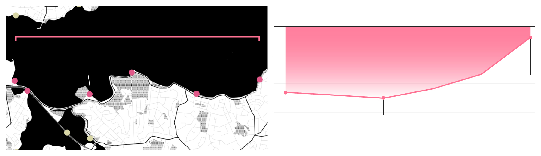
Tauranga/Bay of Plenty

Otamarakau
beach
5mm
Otūmoetai
1.3mm
Mt Maunganui
1.2mm
Tauranga
Matatā
2.9mm
Sea level rise projections at Otūmoetai, Tauranga
Low emissions SSP2-4.5
High emissions SSP3-7.0
9 extra years
to prepare for
50cm rise
1.5m sea-level rise
no vertical
movement
0.5
with
movement
2040
2120
2040
2120
2080
2080

Sea level rise projections
at Otūmoetai, Tauranga
Low emissions SSP2-4.5
1.5m sea-level rise
Mt Maunganui
no vertical
movement
Otūmoetai
1.2mm
1.3mm
0.5
Otamarakau
beach
with movement
5mm
2080
2040
2120
Tauranga
High emissions SSP3-7.0
1.5m
9 extra years
to prepare for
50cm rise
Matatā
2.9mm
0.5
2040
2080
2120

Sea level rise projections at
Otūmoetai, Tauranga
Low emissions SSP2-4.5
Otūmoetai
Mt Maunganui
1.5m sea-level rise
1.3mm
1.2mm
no vertical
movement
Otamarakau
beach
+
0.5
5mm
with movement
2040
2080
2120
Tauranga
High emissions SSP3-7.0
1.5m
9 extra years to
prepare for 50cm
sea-level rise
Matatā
2.9mm
0.5
2040
2080
2120

Sea level rise projections at Otūmoetai, Tauranga
Low emissions SSP2-4.5
Mt Maunganui
Otūmoetai
1.5m sea-level rise
1.2mm
1.3mm
no vertical movement
Otamarakau
beach
with movement
0.5
5mm
2040
2080
2120
Tauranga
High emissions SSP3-7.0
1.5m
9 extra years to
prepare for 50cm
sea-level rise
by 2080
Matatā
2.9mm
0.5
The coast of the Tauranga suburb of Otūmoetai is fairly stable or rising slightly, meaning that - again - the global average sea level rise rate is about correct for this location. On average land in Tauranga rising slightly, though not as quickly as the ocean. Because of that: “You've got a little bit more time to plan because geology has given you a little bit more leeway,” says Levy. However Tauranga locations vary. The Port, for example, is sinking, being built on fill. Further along the coast at Otamarakau beach, the data shows one of the fastest upwards land movements in the country, at 5mm per year. As with Lowry Bay, Wellington, the graphs on the right show the “preparation gap” or how much faster or slower the ocean reaches a certain level. In this case, they show that the suburb of Otūmoetai looks set to get some extra time - nine more years before 50cm of sea level rise hits under a high emissions scenario.
Napier, Hawke's Bay

Westshore beach
2.9mm per year
Airport built in a
wetland and rapidly,
sinking. This area is
really vulnerable
to sea level rise
Napier
Airport
Sea level rise projections at Westshore beach, Napier
Low emissions SSP2-4.5
High emissions SSP3-7.0
2m sea-level rise
36cm rise
3 decades
earlier
with vertical
movement
0.5
no movement
2040
2120
2040
2120
2080
2080

Sea level rise projections
at Westshore, Napier
Wests hore
Low emissions SSP2-4.5
2.9mm per year
2m sea-level rise
Airport built in a
wetland and rapidly
sinking. This area is
really vulnerable to
sea level rise
with vertical
movement
Napier
Airport
0.5
no movement
2080
2040
2120
High emissions SSP3-7.0
2m
36cm rise
3 decades
earlier
0.5
2040
2080
2120

Sea level rise projections at
Westshore beach, Napier
Westhore beach
2.9mm per year
Low emissions SSP2-4.5
Airport built in a
wetland and sinking
rapidly. This area is
really vulnerable
to sea level rise
2m sea-level rise
Napier
Airport
with vertical
movement
0.5
no movement
2040
2080
2120
High emissions SSP3-7.0
36cm rise 3 decades
earlier, a 75% increase
for 2080
2m
0.5
2040
2080
2120

Sea level rise projections at Westshore, Napier
Low emissions SSP2-4.5
Westshore
2m sea-level rise
2.9mm per year
with vertical movement
Airport built in a
wetland and sinking
rapidly. This area is
really vulnerable to
sea level rise
Napier
Airport
no movement
0.5
2040
2080
2120
High emissions SSP3-7.0
2m
36cm sea-level rise
happens 3 decades
earlier, a 75% increase
on what previously
expected for 2080
0.5
2080
2040
2120
Much of Napier is built on reclaimed land, making it vulnerable to sea level rise and subsidence. The Searise estimates suggest Westshore, near the airport, is sinking by 2.9mm a year, almost doubling the effects of sea level rise. Again, the graphs on the right show what that does to Napier’s preparation time, under both middling and high emissions futures. Under the high emissions scenario, 36cm of sea level rise happens three decades earlier than it would have without that local subsidence.
All graphs are based on NZ Searise project (which includes scientists from GNS Science, Niwa and Victoria University) data with Stuff analysis.
Together, we can keep it that way.
Like you, we want a better future for all New Zealanders. We want to know how the Government plans to get to zero carbon, and how the Climate Change Commission's advice will be activated. Our specialist climate desk is committed to covering this global crisis with a unique mix of rigour, reality and resolve.
We're asking for your support to ensure this essential work remains accessible to everyone.
If you're concerned about the climate, please become a Stuff supporter today. Your contribution will help power our climate change reporting, and support our mission to make Aotearoa a better place, together.


